Thursday, July 19, 2012

Thesis Nav Menus


All of the info in this post (except the basics of using jQuery) will be obsolete with Thesis 1.6. Nav classes will be different and dropdowns will be built in.
There has been quite a lot of requests lately for tutorials regarding Thesis nav menus. So, here’s some info for y’all!
This information is significantly XHTML and CSS, so it’s useful for any website really.

BASIC NAV STRUCTURE 

The structure of the Thesis nav menu, depending on the pages and links you have selected to show up, is
<ul id="tabs">
 <li class="current_page_item"><a href="http://example.com/">Home</a></li>
 <li><a href="http://example.com/about/">About</a></li>
 <li><a href="http://example.com/archives/">Archives</a></li>
</li>

So the elements you might want to customise with CSS include,
.custom ul#tabs {styles for whole nav menu here}
.custom ul#tabs li {styles for each item here}
.custom ul#tabs li.current_page_item, .custom ul#tabs li.current-cat {styles for current page or category here}
.custom ul#tabs li a {styles for each item link here}
.custom ul#tabs li a:hover {styles for each item hover link here}
.custom ul#tabs li.current_page_item a, .custom ul#tabs li.current-cat a {styles for current page or category links here}
.custom ul#tabs li.current_page_item a:hover, .custom ul#tabs li.current-cat a:hover {styles for current page or category link hover here}
I’ve been thinking for a while that given the huge amount of Thesis customisation I do, I could do with some custom CSS templates to save me time typing. Some of that could involve a nav reset, so I’ll write one for you and probably use it myself.
.custom ul#tabs {border-bottom:none; border-left:none;}
 .custom ul#tabs li {margin-bottom:0; border:none; background:none;}
 .custom ul#tabs li.current_page_item, .custom ul#tabs li.current-cat {padding-bottom:0; background:none;}
 .custom ul#tabs li.rss {}
  .custom ul#tabs li a {}
  .custom ul#tabs li a:hover {text-decoration:none;}
  .custom ul#tabs li.current_page_item a, .custom ul#tabs li.current-cat a {}
The above removes any borders and fancy stuff… pretty much everything except the padding, main layout and fonts1.
Update 15 April 2009: The behaviour of Thesis nav menus regarding sub-pages may have changed as of 1.5br4. So, this whole dropdown menu approach may be deprecated as of that version. I will update this post when I know for sure.
Update 16 April 2009: The nav menu is handled differently now and there is no page hierarchy, but Chris plans to add it back in. If you are dependent on a submenu now, don’t upgrade to 1.5 before you recode your menu (dropdowns and submenus will need to be coded from scratch again).
Update 21 April 2009: Chris has said that the functionality needed for dropdowns is back in 1.5r6 so the information below should be good to go again (I haven’t tried 1.5r6 yet myself though).
Update: Just confirming that the final release of v1.5 has an option to use the old nav menu: you can’t rename tabs and reorder them, but you can do dropdowns. There will probably be future work to combine these features.
I know, this is what you’re all here for right? There’s a reason they’re not already an option in Thesis and why more sites don’t have them… actually there’s two.
  1. They are a total pain for cross-browser compatibility2.
  2. Some people question the usability: for those who are less dexterous than the rest of us, it can be difficult to hold your mouse in the one spot and then move it smoothly to make sure the dropdown stays open (if it’s on a hover action rather than a click action).
Regarding the latter: as computers and mouses3 improve it might be less of an issue; you might think your demographic won’t have a problem with it; you might think the argument is from purists who are inhibiting your creativity and your site architecture.
Regarding the former: I do not promise that these methods will work in every situation. In fact, the first definitely won’t, and I’ve had some fun issues with overlapping when using z-indexes4with the second method. However, I like these ways because they are simple and clean, and lets face it, dropdown menus are a luxury — you probably don’t put your most important info in there.
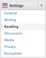
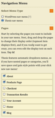
SETTING UP PAGES 

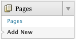
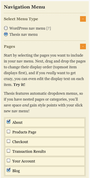
The friendly way to use Thesis’ native menu to make dropdowns is to use pages and child pages. Set these up in the Edit Page area.
Add page parent individually when editing a page.
give WordPress page a parent
You can also batch edit WordPress pages. To do that, select the pages you want to edit with the check-boxes next to them, then go to the top dropdown, select Edit, hit Apply and edit away. Save the changes with the button in the bottom right.
bulk edit WordPress pages
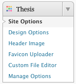
Once you have parent and child pages, add them to the Thesis menu on the Thesis Options page.
thesis-nav-select

STRUCTURE AND STYLE 

Doing the above give us a nice nested list structure. For example,
<ul id="tabs">

 <li class="current_page_item"><a href="http://snoopy.local/mu" title="Home" rel="nofollow">Home</a></li>
 <li class="page_item page-item-2"><a href="http://snoopy.local/mu/about/" title="About">About</a></li>
 <li class="page_item page-item-62"><a href="http://snoopy.local/mu/archives/" title="Archives">Archives</a></li>
 <li class="page_item page-item-74"><a href="http://snoopy.local/mu/portfolio/" title="Portfolio">Portfolio</a>

  <ul>
   <li class="page_item page-item-70"><a href="http://snoopy.local/mu/portfolio/photos/" title="Photos">Photos</a></li>
   <li class="page_item page-item-76"><a href="http://snoopy.local/mu/portfolio/resume/" title="Resumé">Resumé</a></li>
  </ul>

 </li>

</ul>
It also gives us a dirty looking nav.
thesis-nav-nested
So we need some CSS.
.custom ul#tabs li ul {display:none; position:absolute; list-style:none;}
 .custom ul#tabs li ul li {float:none;}
display:none; hides the nested lists from view, while position:absolute; fixes the position of the nested lists so that they don’t push the whole page layout around when we reveal them.list-style:none; and float:none; remove the bullet points and floats that made the sub-menu look so awful.

DROPPING DOWN 

To make this menu dropdown via CSS you can simply use the following.
.custom ul#tabs li:hover ul {display:block;}
Naturally, anything that simple and elegant doesn’t work in IE65. The reason being that IE6 only supports the :hover pseudo element on anchors (i.e., the things that start with <a). IE7 is supposed to support :hover, but there have been problems. I haven’t tested this in IE7 because I don’t have it installed at the moment.
If you don’t care about IE, eat your heart out. If you do care about IE you can use some javascript to allow hovering over list items.
When I first used this javascript it worked fine, and still works fine on that site, but some other sites have problems. IE doesn’t seem to register that the li wraps around the whole dropdown ul so when you move off the initial nav item the dropdown disappears again and you can’t select the sub-nav items. See this comment below for a fix.
And if you’re still having problems try adding .custom ul#tabs {margin-bottom:-0.1em;}(suggestion in comment).
<script type="text/javascript" src="http://ajax.googleapis.com/ajax/libs/jquery/1.3.2/jquery.min.js"></script>

<script type="text/javascript">
 $(function(){
  $("ul#tabs > li").hover(
  function(){
   $('ul', this).show();
  },
  function(){
   $('ul', this).hide();
  }
  );
 });
</script>
What that code does is grabs jQuery from the Google AJAX libraries (I like getting it from them because your users may already have it cached if they’ve been on a site using it and it’s not on your server, so it can load asynchronously). Then, there’s a function that essentially says,
When the page is loaded, hovering over ul#tabs li causes the ul in this element to be shown, then hidden when you move away from the li again.
To use it, you should insert it into the head of your site. In Thesis you can do this by putting it incustom_functions.php and wrapping it with function jquery_nav() { ?> at the start and <?php } add_action('wp_head','jquery_nav'); at the end.
Dropdown menu in Thesis
This does work in IE6, although I will admit to having some problems hovering over the elements in the nested lists when I had some nearby elements with z-indexes. Otherwise it has been fine.

ALMOST THE END

The other thing is that you might want to make a dropdown that is not just pages and child-pages. There are a few ways to go about it; some more complicated than others. I think the simplest of these ways is to rewrite the nav menu in HTML to suit you.
So, take the example nested code and write out your nav menu with nested lists. You can also add the dynamic current-page classes with PHP as shown in my Snipplr snippet, Nav menu for Thesis. The snippet also shows the code needed to replace the default nav.

THE END

Let me know if you have problems with this. I can’t promise I’ll be able to fix them, but it’d be useful for everyone to know the caveats anyway.

Full-width headers in Thesis 1.5


Although the title is “in Thesis 1.5″ this tutorial is still relevant. I have made a couple of updates since it was first written to accomodate more recent changes in Thesis, but really this tutorial is for Thesis 1.5 and beyond!
I previously published a tutorial on full-width headers in the Thesis theme.
It wasn’t the easiest thing to do in Thesis, prior to version 1.5, to make a full-width navigation area beneath a full-width header. Now thanks to a new hook,thesis_hook_before_content_area, it has become significantly easier and way better!

The code in the previous tutorial had us make a new title area in order to place the nav areawherever we wanted. However, that created some invalid code, by duplicating div id="header"1. We don’t need to do that anymore!

STEP 1 — FULL-WIDTH FRAMEWORK 

Thesis Full Width Framework
In the Thesis Design Options you need to set your framework to full-width.
This produces HTML that look like:
<div id="header_area" class="full_width">
 <div class="page">

  <ul id="tabs">
   ...
  </ul>

  <div id="header">
   <p id="logo"><a href="http://snoopy.local/mu">Snoopy Test Sites</a></p>
   <h1 id="tagline">Just another Snoopy.local weblog</h1>
  </div>

 </div>
</div>
With that in place you can create a full-width header background with CSS.
This goes in custom.css
.custom #header_area {background:#213C63;}
 .custom #header_area .page {background:transparent;}
  .custom #header {border-bottom:0;}
Update 25th February 2010: Added CSS for .custom #header_area .page to work with the new CSS in Thesis 1.6 related to the colour Design Options.
Thesis Header Background

STEP 2 — FULL-WIDTH NAV AREA 

The code you need for a full-width nav area goes something like…
This goes in custom_functions.php
function full_width_nav() { ?>
 <div id="nav_area" class="full_width">
  <div class="page">
   <?php thesis_nav_menu(); ?>
  </div>
 </div>
<?php }
remove_action('thesis_hook_before_header', 'thesis_nav_menu');
add_action('thesis_hook_before_content_area', 'full_width_nav');
The line remove_action('thesis_hook_before_header', 'thesis_nav_menu'); removes the nav menu from its default position, allowing us to reinsert it wherever we want.
add_action('thesis_hook_before_content_area', 'full_width_nav'); adds the new navigation area after the full-width header area. If you’d like it to go before the header, useadd_action('thesis_hook_before_html', 'full_width_nav'); instead.
The rest of the code gives us a nice bit of HTML, similar format to the other full-width areas of Thesis, which we can style with CSS.
.custom #nav_area {background:#F0ECDB;}
And here’s just a bit more CSS to make it look prettier…
.custom #nav_area {background:#F0ECDB; border-bottom:1px solid #DBD4B7; padding-top:10px;}
 .custom #nav_area .page {background:transparent;}
  .custom ul#tabs {border-bottom:0; border-color:#DBD4B7;}
   .custom ul#tabs li {border-color:#DBD4B7; background-color:#E6DEC0;}
   .custom ul#tabs li.current_page_item, .custom ul#tabs li.current-cat {background:#fff;}
Update 12th May 2010: Added CSS for .custom #header_area .page to work with the new CSS in Thesis 1.6 related to the colour Design Options.
Thesis Full-width Nav
Check out my previous tutorial, or CSS custom headers for info about adding images to your header. Also see Thesis nav menus for more info about the navigation code.

3 Simple and Effective Comment Styling Tips for Thesis


our community talks in your comments section. To facilitate this conversation, you want your comments section to be easy-to-follow because it will encourage interaction and loyalty.
“Out of the box,” Thesis Theme gives you the ability to enable threaded comments, which promotes conversation, and provides a slew of other options that let you tweak this area of your blog.
However, what if you want to further customize how your comments are displayed?
Since the structure of the code in the comments section is neatly broken down, there are some simple CSS tricks that will help you enhance your Thesis comments section and keep your discussion flowing.
To help you understand these CSS tricks, let’s take a look at three changes I made to my own blog. Ready? Here we go!

1. Box “Thread” Discussions

Thesis is compatible with WordPress’ threaded comments system (Settings → Discussion), which is great because it keeps conversations flowing.
The problem is, if you get a lot of comments per article, it may be tough to keep up with all of the discussions…mostly because of how cramped text can look.
To solve this, I added some CSS to the custom.css file that splits up each comment into their own separate box. With this trick, each conversation will be contained in their own little silo in the comments section.
To show you what I’m talking about, here’s an example:
Thesis theme comment styles
FIGURE 1. You can copy/paste the CSS below to create awesome Thesis comment styles like these!
If you want a similar effect to that pictured above, all you need to do is paste these three lines of code in your custom.css file:
.custom #comment_list { background: #000; padding: 1em; }
      .custom #comment_list dd { margin-bottom: 1em; }
      .custom #comment_list .comment { background: #FFF; }
Before we continue, let’s take a look at what this code does:
  • .custom #comment_list — Adds an outer border color to the entire comments box, and the padding will add space to all sides of this box.
  • .custom #comment_list dd — Adds bottom spacing to every comment so they are broken up. Also, I recommend you keep the margin and padding values the same.
  • .custom #comment_list .comment — Adds a background color that should contrast with the outer box.
Note, depending on your theme, there may be some additional adjustments needed.

2. Highlight Author Comments

The best way to encourage discussion in your comments section is reply to your readers.
Since you want them to know you replied, it’s a best-practice to make your own comment stand-out from the rest.
Luckily, Thesis makes styling your own comments simple because it automatically detects comments left by the author and assigns a special CSS class that you can edit yourself.
To get started editing, here’s the core code:
.custom dl#comment_list dt.bypostauthor, .custom dl#comment_list dd.bypostauthor>div { background: #FF0000; }
Where do you start?
Well, you can do anything you like. For example, you could add a background image, a border, change the background color, and etc. Here’s an example:
Thesis Theme author comment styles
FIGURE 2. It’s easy to modify your author comments with Thesis’ built-in CSS targeting.
Source: MattFlies

3. Style “Reply” Link

Thesis reply to comment linkTo further increase conversation, you should encourage your readers to reply to each others’ comments.
To achieve this, first, you’ll want to enable threaded comments (Settings → Discussion). When you have them enabled, you empower your readers to reply to each other because Thesis automatically adds a Reply link at the bottom of each comment.
The question is, how do you persuade your readers to click reply?
That’s simple…just make your reply link noticeable!
As always, with Thesis, this is easy because there’s a CSS class that allows you to easily stylize your reply link. For example, the code below will add a gray box around your reply link, which will make it pop-out more.
.custom .comment-reply-link { background: #EEE; padding: 0.4em; -moz-border-radius: 5px; -webkit-border-radius: 5px; }
Basically, what I’ve done is add a background color and some padding. Then, the other two pieces of code will make the box rounded for anyone using Mozilla-based or Webkit-based browsers (Firefox, Chrome, and Safari).

In Conclusion

Thesis gives you the flexibility to customize any aspect of your comments section. Today, I showed you how you can improve the usability and interface of your comments section with 3 simple adjustments that are easy to install and customize.

How to Create an Online Store and Shopping Cart With Thesis


If you’re trying to build a business online, creating an online store is one of your best bets. After all, that’s how Amazon.com and Zappos.com did it.
The problem is, to create a successful e-commerce site, you need to worry about design, functionality, and security…all of which can be quite expensive.
Luckily, there’s an easier way! When you combine the wonderful WP e-Commerce plugin by Instinct Entertainment with Thesis, you’ll get a stunning online store that is SEO optimized, feature-packed, and geared for sales.

Which Type of Online Store Do You Want to Create?

There are two key ways you can implement the WP e-Commerce plugin with the Thesis Theme for WordPress: gallery view or standard view. What’s the difference?
Quite simply, the only difference between the two is how the homepage looks. To see what I mean, keep reading.

1. The Gallery View Store

When you have a store with a Gallery View home page, you’ll see products arranged in a grid, with products spanning horizontally and vertically. Check out figure 1 for a demo:
FIGURE 1. To see what gallery view looks like on a live site, click here.

2. The Standard View Store

When you create a Standard View online store, your products will be listed vertically with product details right on the homepage. To see what I mean, check out figure 2:
FIGURE 2. To see what standard view looks like on a live site, click here.
Now let’s dive right in and I’ll show you how to set up both types of online stores. Oh, and don’t worry, I’m going to make this as easy and painless as possible!

Before We Get Started…

For this tutorial, I’m going to assume you have a fresh installation of WordPress, Thesis Theme for WordPress, and the WP e-Commerce plugin on your site. If so, let’s get started.

The Gallery View Online Store

Step 1: Make Your Permalinks Pretty

While this step isn’t 100% necessary for a functional e-Commerce store, it adds to the “believability” of your shop. Personally, I know I’m much more likely to buy from a site with URLs like this: www.website.com/tshirt/phillies, instead of like this:www.website.com/?p=2374.
Plus, it’s smart to configure your permalink structure prior to doing anything else because it’s quick, good for SEO, and can prevent headaches down the road!
I personally like my permalinks structured as www.mysite.com/category/postname, however, you can structure your permalinks anyway you like. I would only advise not to use the default setting. To find out more about permalinks, the WordPress Codex has some great information.
To change your permalink structure, go to Settings → Permalinks, choose “Custom Structure” and then insert your custom permalink structure. I use/%category%/%postname%/ since I like my permalinks to look likewww.mysite.com/category/postname (click here for an image).
Lastly, click on the Save Changes button.

Step 2: Create a Custom Home Page in WordPress

Since we want our home page to include a Gallery for our online shop, we need to move our blog posts to another page, which is really simple with the latest WordPress backend (version 3.0+).
First, you’ll need to create two brand-new pages:
  1. Go to Pages → Add New. (click here for an image)
  2. Enter Blog as the title, and then Publish it.
  3. Go to Pages → Add New once again.
  4. Enter Home as the title, and then Publish it.
We now need to move our posts to the Blog page and set the Home page as the new home page.
  1. Go to Settings → Reading (click here for an image)
  2. Next to “Front page displays”, choose “A static page.” (click here for an image)
  3. From the dropbox next to “Front page,” choose Home.
  4. From the dropbox next to “Posts page,” choose Blog.
  5. Click on the Save Changes button.

Step 3: Enable the Navigation Menu

To enable the Thesis nav menu, go to Thesis → Site Options (click here for an image). Under “Navigation Menu,” choose “Thesis nav menu” and then under “Pages,” check off the pages you want to include in your menu (click here for an image).
Do not check the “Home” page. It is already included in your navigation menu since you set it as your home page in Step 2. If you do check it, the “Home” link will appear twice in your menu.
Finally, click on the Big Ass Save Button.

Step 4: Build Our Gallery Using the Custom Loop API – custom_functions.php

To create the Gallery View Online Store, you’ll need to use the Custom Loop API. To do this, navigate to your custom_functions.php and insert the following code at the bottom of the page:
$gallery = new homepage_gallery;
class homepage_gallery extends thesis_custom_loop {
function front() {
?>
<div class="galleryrow">
<a href="http://www.productlink1.com/"><img src="../wp-content/uploads/2010/09/product1.gif" width="150" height="150" alt="Product Name 1" /></a>
<a href="http://www.productlink2.com/"><img src="../wp-content/uploads/2010/09/product2.gif" width="150" height="150" alt="Product Name 2" /></a>
<a href="http://www.productlink3.com/"><img class="imgright"  src="../wp-content/uploads/2010/09/product3.gif" width="150" height="150" alt="Product Name 3" /></a>
</div>
<div class="galleryrow">
<a href="http://www.productlink4.com/"><img src="../wp-content/uploads/2010/09/product4.gif" width="150" height="150" alt="Product Name 4" /></a>
<a href="http://www.productlink5.com/"><img src="../wp-content/uploads/2010/09/product5.gif" width="150" height="150" alt="Product Name 5" /></a>
<a href="http://www.productlink6.com/"><img class="imgright" src="../wp-content/uploads/2010/09/product6.gif" width="150" height="150" alt="Product Name 6" /></a>
</div>
<div class="galleryrow">
<a href="http://www.productlink7.com/"><img src="../wp-content/uploads/2010/09/product7.gif" width="150" height="150" alt="Product Name 7" /></a>
<a href="http://www.productlink8.com/"><img src="../wp-content/uploads/2010/09/product8.gif" width="150" height="150" alt="Product Name 8" /></a>
<a href="http://www.productlink9.com/"><img class="imgright" src="../wp-content/uploads/2010/09/product9.gif" width="150" height="150" alt="Product Name 9" /></a>
</div>
<?php
}
}
Notice that the last image of each galleryrow has a CSS class of .imgright (click here for an image). I included this CSS class for the last item in each row so that in Step 6 we can set the right margin to 0 for these images. This will ensure proper alignment within the page.
Each gallery item has the following:
  • href – the link to the “Individual Product Page” (we will replace this in step 8 )
  • src – the file location of the image (we will replace this in step 5)
  • width – the width of the image
  • height – the height of the image
  • alt – the alternate text for the image
In the example above, we have 3 rows with 3 products in each row. If you wanted to change it up, all you’ll have to do is add/remove extra links between the </div> tags. To make it fit, you may have to tweak the sizing of the images as well.
Note: In the above code, you’ll need to replace productlink.com with the appropriate product link. You’ll also need to set the correct image url.

Step 5: Upload Your Gallery Images

Return to your Dashboard, and under Media → Add New (click here for an image) upload each image you want to use for your Gallery View. We set the width and height of our images to 150px in Step 4. Ideally, your images should be the same size.
After you upload each image, copy the File URL for that image (click here for an image). Then, return to your custom_functions.php file and replace the image source (src) with the File URL source you just copied (click here for an image). Repeat this for each product image.
Your home page should now look similar to Figure 3:
FIGURE 3.This is how your e-Commerce store will look with a default Thesis Theme install.

Step 6: Let’s Make It Look Good – custom.css

Assuming the Thesis default column widths are still intact and you chose the original 3 by 3 Gallery View structure from Step 4, you could use the following code in yourcustom.css file to style your Gallery images:
.custom .galleryrow {
padding: 3px 0; /* Adds padding to the top and bottom of each row */
}

.custom .galleryrow img {
margin-right: 6px; /* Adds a margin to the right of each image */
padding: 4px; /* Adds padding around each image */
border: solid 2px #B8B8B8; /* Adds a border around each image */
}

.custom .galleryrow .imgright {
margin-right: 0; /* Adds a margin of 0 to the right of the last image in each row */
}
This assumes that each Gallery image is 150px by 150px. Your images can be a different size; you will just need to adjust the width and height for each product in yourcustom_functions.php file and then tweak the styling in your custom.css file.

Step 7: Store Categories

Now you’ll want to set-up your shop’s categories. It’s especially important if you used the category in your permalinks in Step 1.
In your Dashboard, under Store → Categories (click here for an image), click on “Add new category to the ‘Categories’ group” (click here for an image). Do this for each category you would like to use.

Step 8: Add Your Products to the Store

Now it’s time for the meat and potatoes of your shop – your actual products…
Under Store → Products (click here for an image), add each of your products. There are many settings you can choose from, however, it’s important to include the Product Name, Price, Category, and Image. You can go back and configure the other options after your shop is set-up.
Please note: The image you used for your Gallery View in Step 5 will not display on its “Individual Product Page”. You will need to upload a new image for its “Individual Product Page”. It can be different than the image you used in your Gallery. For example, the Cross Brothers Apparel site has a different image on itshome page than it does on its “Individual Product Page”.
Now, go to your website and navigate to the “Products Page”. Click on the title of a product. Once you are at the “Individual Product Page” for the product, copy its permalink from the top of your browser. Then, return to your custom_functions.phpfile and replace the href for the product with the permalink you just copied (click here for an image). Repeat this for each product in your shop.

Step 9: Check It Out!

FIGURE 4. Here’s how your Gallery View Online Store will look.

The Standard View Online Store

Step 1: Make Your Permalinks Pretty

While this step isn’t 100% necessary for a functional e-Commerce store, it adds to the “believability” of your shop. Personally, I know I’m much more likely to buy from a site with URLs like this: www.website.com/tshirt/phillies, instead of like this:www.website.com/?p=2374.
Plus, it’s smart to configure your permalink structure prior to doing anything else because it’s quick, good for SEO, and can prevent headaches down the road!
I personally like my permalinks structured as www.mysite.com/category/postname, however, you can structure your permalinks anyway you like. I would only advise not to use the default setting. To find out more about permalinks, the WordPress Codex has some great information.
To change your permalink structure, go to Settings → Permalinks, choose “Custom Structure” and then insert your custom permalink structure. I use /%category%/%postname%/ since I like my permalinks to look like www.mysite.com/category/postname (click here for an image).
Lastly, click on the Save Changes button.

Step 2: Create a Custom Home Page in WordPress

Since you want your home page to include our Standard View for your shop, you need to move our blog posts to another page.
First, you must make one new page:
  1. Go to Pages → Add New. (click here for an image)
  2. Enter Blog as the title, and then Publish it.
Then, you need to move your posts to the Blog page and set the Products Page as the new home page.
  1. Go to Settings → Reading. (click here for an image)
  2. Next to “Front page displays”, choose “A static page.” (click here for an image)
  3. From the dropbox next to “Front page,” choose Products Page.
  4. From the dropbox next to “Posts page,” choose Blog.
  5. Click on the Save Changes button.
To eliminate the “Comments on this entry are closed” text at the bottom of your home page, go to Thesis → Design Options → Display Options → Comments and uncheck “If comments are closed, display a message” (click here for an image).
Lastly, click on the Big Ass Save Button.

Step 3: Enable the Navigation Menu

It’s a good idea to enable your navigation menu so that you can check our progress later in the tutorial.
To enable the Thesis nav menu, go to Thesis → Site Options (click here for an image). Under “Navigation Menu,” choose “Thesis nav menu” and then under “Pages,” check off the pages you want to include in your menu (click here for an image).
Do not check the “Products Page.” It is already included in your navigation menu since you set it as your home page in Step 2. If you do check it, the “Products Page” link will appear twice in your menu.
Finally, click on the Big Ass Save Button.

Step 4: Store Categories

At this point, you’ll want to set up your shop’s categories. It is important if you used the category in your permalinks in Step 1.
Under Store → Categories (click here for an image), click on “Add new category to the ‘Categories’ group” (click here for an image). Do this for each category you would like to use.

Step 5: Add Your Products to the Store

Now it’s time for the meat and potatoes of your shop—your actual products.
Under Store → Products (click here for an image), add each of your products. There are many settings you can choose from, however, it’s important to include the Product Name, Price, Category, and Image. You can go back and configure the other options after your shop is set up.
By default, the WP e-Commerce plugin shows the P&P on the “Products Page.” To turn this off, go to Store → Settings → Presentation. Then, next to “Show Postage and Packaging,” choose “No.” Finally, click on the Update button.

Step 6: Check It Out!

FIGURE 5. Here’s how the Standard View Online Store Looks.

You’re Good to Go

Congratulations! You are now the proud owner of a killer Thesis e-commerce website to show off your awesome products. Now go on and make some money!